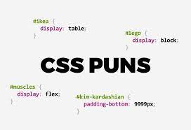
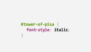
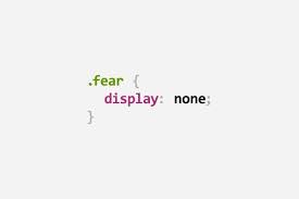
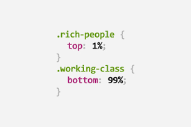
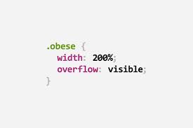
Are you prepared to dive into the delightful realm of CSS humor? Whether you’re a veteran Web Designer or simply someone who loves a good chuckle, these CSS jokes and puns will surely brighten your day. From witty wordplay involving color codes to amusing quips about coding mishaps, there’s a little something for everyone in the CSS comedy universe. So, kick back, unwind, and let’s journey through the fun and quirky side of web development together!
Ever wondered why the style sheet broke up with HTML? Well, it turns out they just couldn’t agree on the layout! It’s like trying to fit a square box into a round hole – sometimes, the styles just don’t align. HTML wanted everything in a neat, orderly structure, while CSS preferred a bit of flair and creativity. In the end, their differences were just too much to handle.
A Class Act:
Did you know what a group of CSS developers is called? It’s a class act! Because when it comes to styling, they always bring their A-game. From colors to fonts to layouts, CSS developers know how to make a webpage shine.
CSS Fitness Routine:
How does CSS stay in shape? With style sheets, of course! CSS is like giving your webpage a workout – adding margins here, padding there, and ensuring everything is in the right place. Just like a good fitness routine keeps you healthy, a well-styled webpage ensures everything looks crisp and clean. A well-designed website is healthy
The Cold Website:
Ever wondered why a website felt cold? It forgot to add a background color! It’s an easy fix that can make a big change. Just like adding a coat of paint can transform a room, adding a background color can bring warmth and life to a webpage. So, next time your site feels a bit chilly, remember to add that splash of color!
Web Designer's Anthem
What’s a web designer’s favorite song? “Don’t Stop Believin’ in Responsive Design!” Because in a world where devices come in all shapes and sizes, responsive design is key. It’s about ensuring that your webpage looks great no matter what device your audience is using.
The Selective Selector
Why did the CSS selector go to therapy? It had too many unresolved issues! Selectors are like the detectives of CSS, trying to find and style the right elements on a webpage. But sometimes, they can get overwhelmed with too many choices.
The Font Family Reunion
What happens at a font family reunion? They all get styled together! Web design has been a crucial part of fonts selection thanks to the support of CSS which gives a user an opportunity to come up with the most suitable text face in line with his/her web page`s tone and style.. It’s like bringing all the relatives together – each with its unique personality – to create a harmonious and visually appealing design.
The Box Model Dilemma
Why did the box model go on a diet? It wanted to reduce its margin! The box model is a fundamental concept in CSS, defining how elements are displayed and spaced on a webpage. Sometimes, the best design can be achieved by trimming margin slightly.
The Flexbox Fable
Why did the developer bring a Flexbox to the party? Because it’s always game! This is how you can describe Flexbox – a tool that makes it simple to design responsive and fluid structures with powerful CSS layout system behind it. It feels as though you have an all-around device for styling with Flexbox because it would just adapt everything correctly depending on whatever screen size you’ve got or whichever gadget is being used.
The Overflow Incident
What did the overflow say to the container? I just can’t contain myself! One of the most frequent concerns when working with CSS is content that overflows its container. But with the right styling techniques, you can keep everything neatly contained. Just like managing a spill, knowing how to handle overflow ensures your content stays within its boundaries, creating a clean and organized layout.
The Z-Index Zenith
The reason for which the element reached its maximum z-index value is that it carries more weight. In CSS z-index is used to determine how elements appear one on top of another in a static webpage. This might seem like putting papers on a table such that none is obstructed by another.
The Animation Celebration
In what way do elements move through CSS ? Well the answer is through animations. CSS animations brighten up web pages by giving them life and motion thus enabling one to have interesting user experiences. This is the same as arranging for a dance recital digitally on your monitor screen.
The Hover Effect
Why did the element hover? It wanted to show off its style! Hover effects in CSS add interactivity and visual flair to elements on a webpage. It’s like giving your users a little surprise when they mouse over certain areas.
The Transition Transformation
CSS expresses the most favorite illusion of what kind of magic? Transition transformations! Properties like color change, size or position can be smoothly animated by using CSS transitions. Therefore, this is comparable to imbuing some sort of enchantment into those shifts in your web pages.
The Media Query Magic
How does CSS work on various gadgets? Have you ever thought about using media queries yourself? They help in developing responsive designs which can change depending on screen sizes or even the features present in the device being used. In other words, it is as if you had a website page which already knows what outfit to put on at all times!
The Grid Layout Symphony
I green rectangle was selected by the developer because? So that a perfect bailarina would be the layout CSS Grid is a powerful layout system that allows you to create complex and responsive grid-based designs. Like conducting a symphony of elements on your webpage.
The Debugging Dilemma
The programmer had a magnifying glass because they wanted to check for some tiny fashion mistakes on codes! It is like being in a detective story when one is debugging their webpage style codes using MS Word or any other text editor tool; however if used properly anyone can sort out all shading problems which seem to require much code thereby making them more complicated than before.
The Custom Property Chronicles
Why did the developer create custom properties? To add a touch of personalization to the styling palette! CSS custom properties allow you to define reusable values that can be used throughout your stylesheet. It’s like having a customizable color palette for your webpage.
The Dark Mode Delight
Why did the developer embrace dark mode? Providing a stylish and eye-friendly experience for users. Dark mode has become a popular design trend, offering a sleek and modern look while reducing eye strain in low-light environments.
The Browser Compatibility Quest
Why did the developer test in multiple browsers? To ensure a seamless experience for all users! Browser compatibility is a crucial aspect of Web Development, and CSS plays a key role in ensuring that your styles render correctly across different browsers and devices.
The CSS Zen Garden
Why would anyone visit the CSS Zen Garden? In search of motivation and to reveal the craftsmanship of CSS! The CSS Zen Garden is an endeavor that illustrates how CSS can alter the appearance and impression of a site devoid of rephrasing the original context.
The Responsive Design Revelation
Why did the developer prioritize responsive design ?So as to meet every audience requirements on every device as possible! Important it is in today’s digital world because of the fact that a lot of people use different tools all over, such as mobile phones up to desktop computers.
The Future of CSS
What’s next for CSS? Limitless possibilities and continued innovation! CSS is constantly evolving, with new features and capabilities being introduced to enhance the styling and design capabilities of web developers.
Conclusion
In sum, CSS jokes make web development a more amusing field to be in. Whether you’re a seasoned coder or just starting your journey, these jokes and puns are sure to bring a smile to your face and remind you of the creativity and fun that can be found in CSS styling. So, keep coding, keep laughing, and may your web designs always be stylish and engaging! I am
Pravin Parmar and I am a WordPress Developer who builds custom themes, plugins, and client websites. Let’s talk with me.
